Nazaré Mavericks
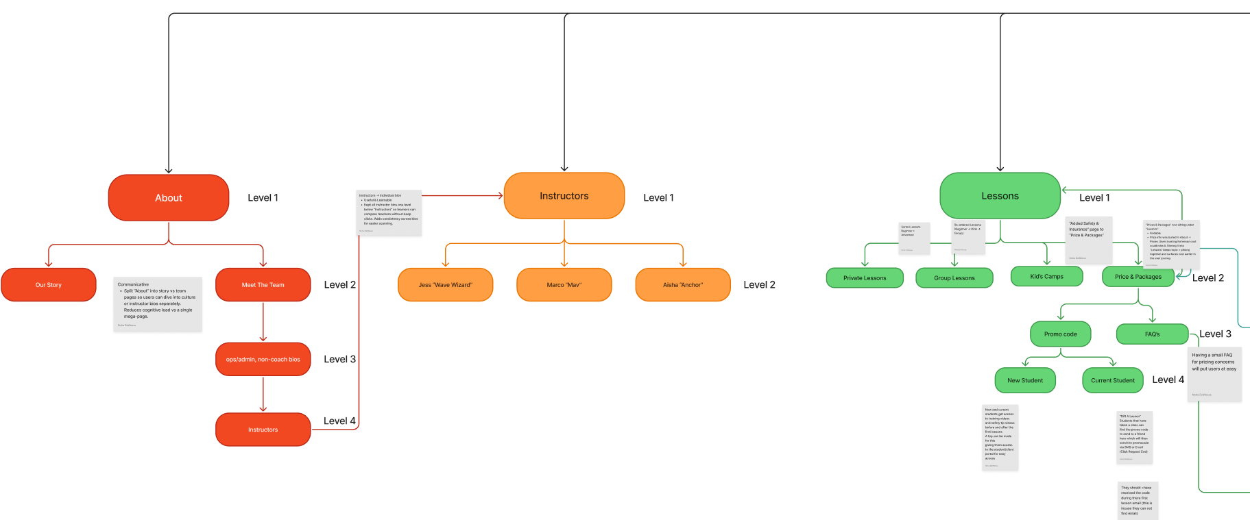
I clarified vague labels, grouped related content, and reorganized pages to match UX best practices and make navigation easier. I used IA checks—clear labels, consistent hierarchy, and improved findability—to increase clarity and discovery across the site.
I analyzed user flows to identify drop-offs and friction, measured where users left the intended path, and recommended fixes: reducing steps, clarifying CTAs, and adding contextual guidance to lower abandonment and improve the overall experience.
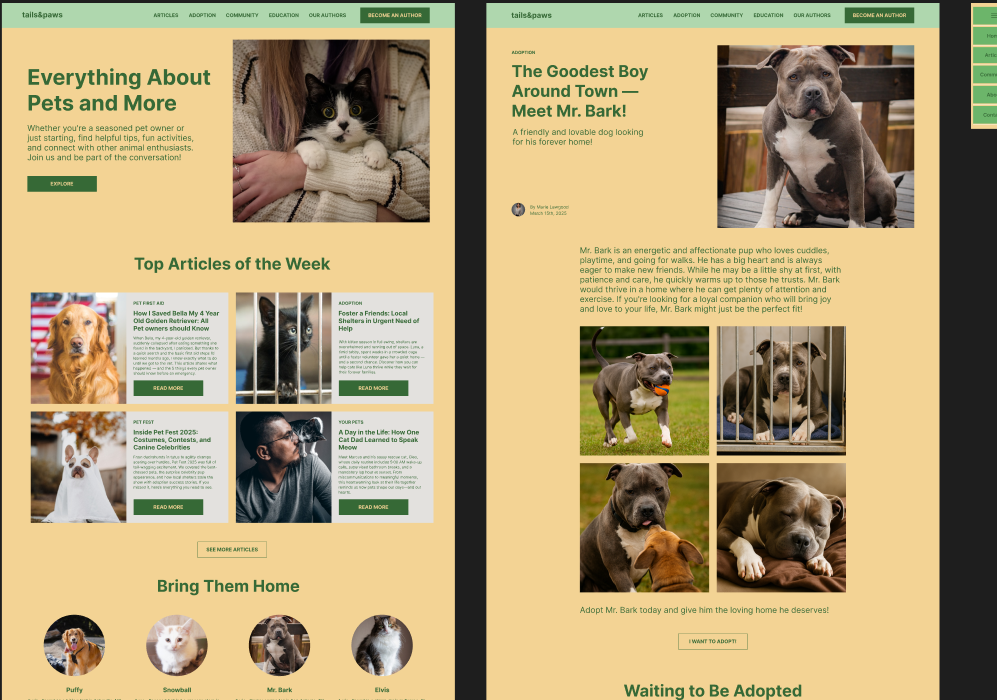
Tails&Paws
After initial layouts were completed, I iterated on the design to better align with scalable UI practices. I created a dedicated Style Guide and Component Library to define typography styles, a structured color system, and reusable UI components.
Core components such as buttons, cards, icons, headers, and footers were converted into reusable components and applied consistently across screens. This approach improved visual consistency, simplified updates, and better prepared the design for future growth or handoff.
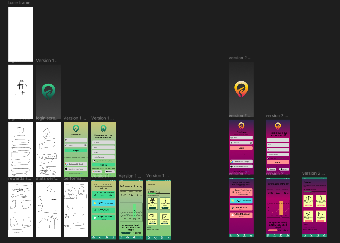
Freeroam
As the project evolved, the interface became visually cluttered with repeated UI elements and inconsistent color usage across screens. Some components, like buttons and cards, were not fully componentized, which hurt consistency and scalability.
I refined the layout to reduce clutter by grouping related information and simplifying the content hierarchy. I standardized color usage for better visual balance and reworked key UI elements into reusable components to improve consistency and support future scaling.